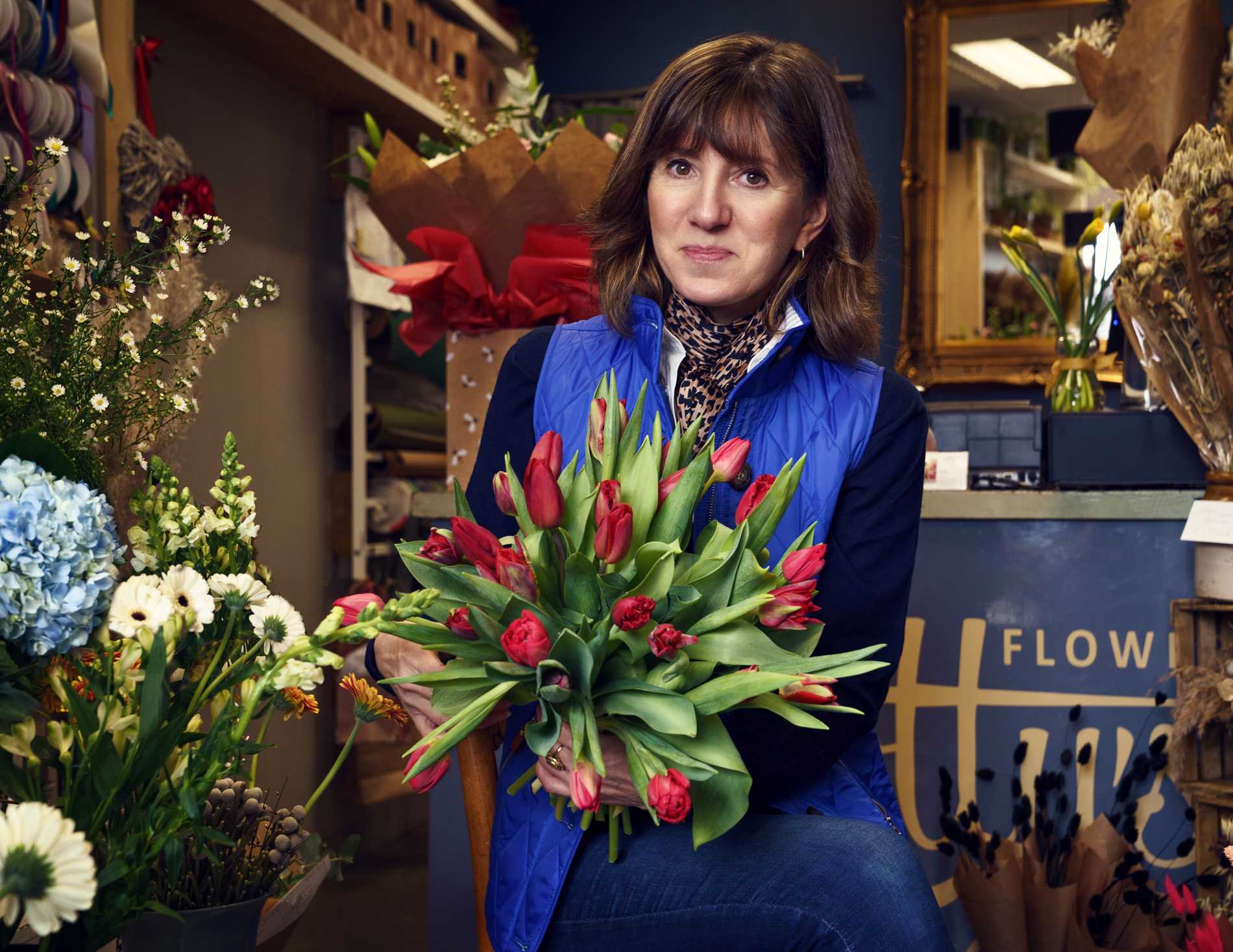
Lotty’s Flowers Faversham
Up to 90% of impression we form of another within the first 90 seconds of meeting them is based on colour alone.
This includes meeting people online through their images where you don’t get the opportunity to show them your winning personality.
Florists have to understand colour theory – what colours look good together and in what proportions. I knew I could trust Charlotte from Lotty’s Flowers in Faversham to choose wisely and so we only spoke very briefly about it.
Charlotte’s brand colours are blue and gold – complementary colours. You’ll notice she also wears blue and a yellow/gold scarf around her neck – this is no accident! The addition of the flowers brings in green and red making this a tetrad of colours – it’s one of the colour combinations that really works!
For help using colour to unify your images and create an impact, please email or DM for a free consultation.