9 Ways to Make Your Marketing Images Pop
Composition is the key to successful marketing images. No marketing campaign can be successful without great photographs. We all know that some photographs make us lust after whatever they’re selling, while others leave no impression.
When I first started taking photographs for the business I worked in, I was always disappointed with my images – they were never how I had visualised them and nothing like the images I admired. I finally went and studied photography and discovered composition.
We’re going to look at nine compositional elements that you can easily incorporate into your marketing images.
1. Central Composition
Placing your subject in the middle of the frame is the most commonly used composition and therefore the dullest. By instinct we put the most important object in the middle of the frame. It’s a very pointed, ‘look at this!’
That said, central compositions work very well in a square frame. This is no doubt part of Instagram’s success. It can also work well in portrait view for business portraits as well.
The question is, how do you make your marketing images more interesting?
2. Rule of Thirds
After the central composition, this is probably the most well-known principle. You’ll notice that when you upload an image to Instagram it automatically puts your image into a grid divided into thirds like a noughts and crosses board.
This breaks up the central composition and creates interest by placing your point of significance along one of the four lines and ideally at the intersection of the lines.
Here you can see the model’s right eye (our left) is placed on the top left intersection of the grid and her other eye is around the top horizontal line. She’s looking down so that you follow her eyes and start to build a story around what she might be looking at or thinking.
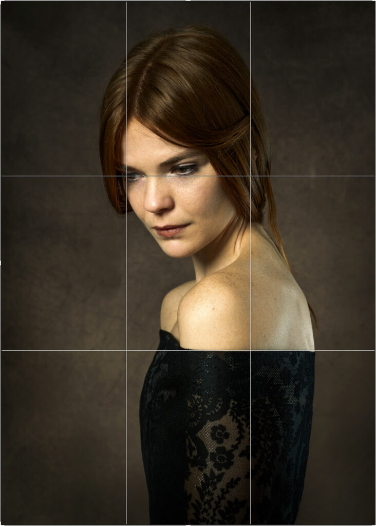
This is a really easy one to remember because we’re used to seeing it every time we upload an image to Instagram.
3. Lines
In our environment we’re surrounded by actual or perceived lines. Actual lines are things like roads, canals and railway lines. Perceived lines are where a series of objects suggest a line, like a row of trees, a row of ducks, a row of flowers. Even our description in calling them “rows” tells us how we’re inclined to find the line.
We use diagonal, horizontal and vertical lines to mean different things. I’m using the same image to demonstrate all of these so you can see how they work together.
Diagonal Leading Lines
Diagonal lines can be used to draw us into an image. They may come in from any of the four corners, or thereabouts, and can either be straight diagonal lines like a canal or they might snake their way into the image, like a winding river. Diagonals work best when they lead you to the focal point of the image.
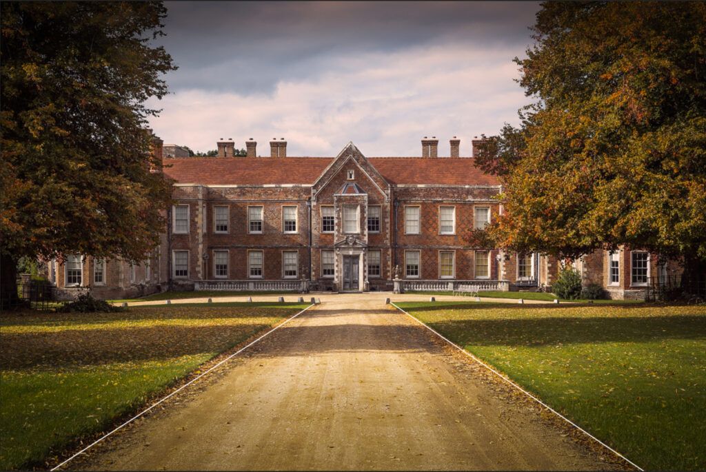
This pathway in the image below gives us two leading lines coming in from both bottom corners and leading us to the entrance. They effectively act as an arrow because they form a triangle with the bottom of the frame.
Horizontal Lines
Horizontal lines often give a feeling of calm and tranquillity. You see them in landscape photography a lot. The skyline often acts as a horizontal in landscape images which makes the image feel balanced. Very often people photograph a beautiful sunset, but the horizon line, rather than being horizontal, is a diagonal which obliterates the feeling of tranquillity because our brain is frantically trying to straighten it.
There are so many horizontals in the image above, created by the roof, the tops and bottoms of the windows, the bottom of the house, and the top and bottom of the wall in front of the house. They give the impression of a tranquil household.
Vertical Lines
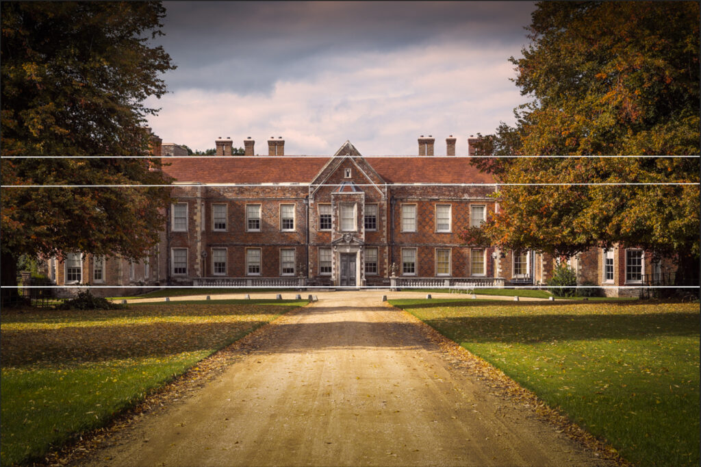
Vertical lines give a feeling of strength, stability and grandeur. If you had a choice of two houses, one with straight walls and the other with leaning walls, you’d obviously choose the one with straight walls because it’d feel safer. People that stand up straight look stronger than people who are hunched over because we associate the former with health and vigour and the latter with weakness.
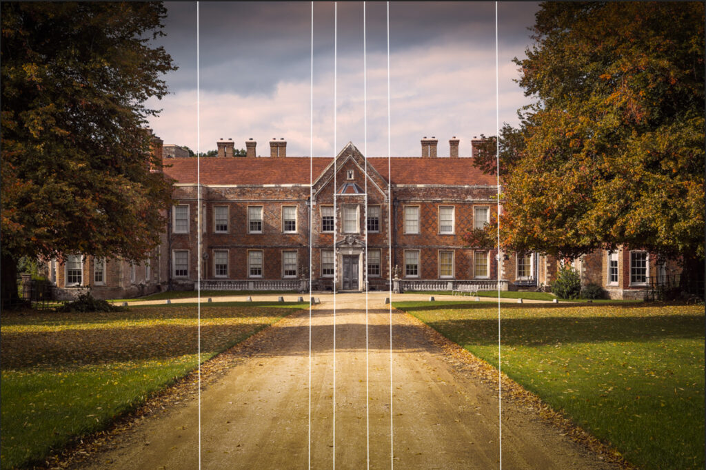
This house has a lot of verticals and therefore looks stronger than say a block of flats because while the block of flats continues up in one long straight line, this house has numerous verticals because of the number of windows and the protrusions of the building itself – I’ve just highlighted a few for you.
For me, this image invites me to the house, tells me that it’s a calm place to be and that it has the strength to withstand the storms. When I was at The Vyne, which is the name of this house, that is exactly what I felt.
You can use so many things to create lines including clothing, legs, arms, shadows, tables, streets, buildings, rows of chairs or any repetition of objects that lead the eye.
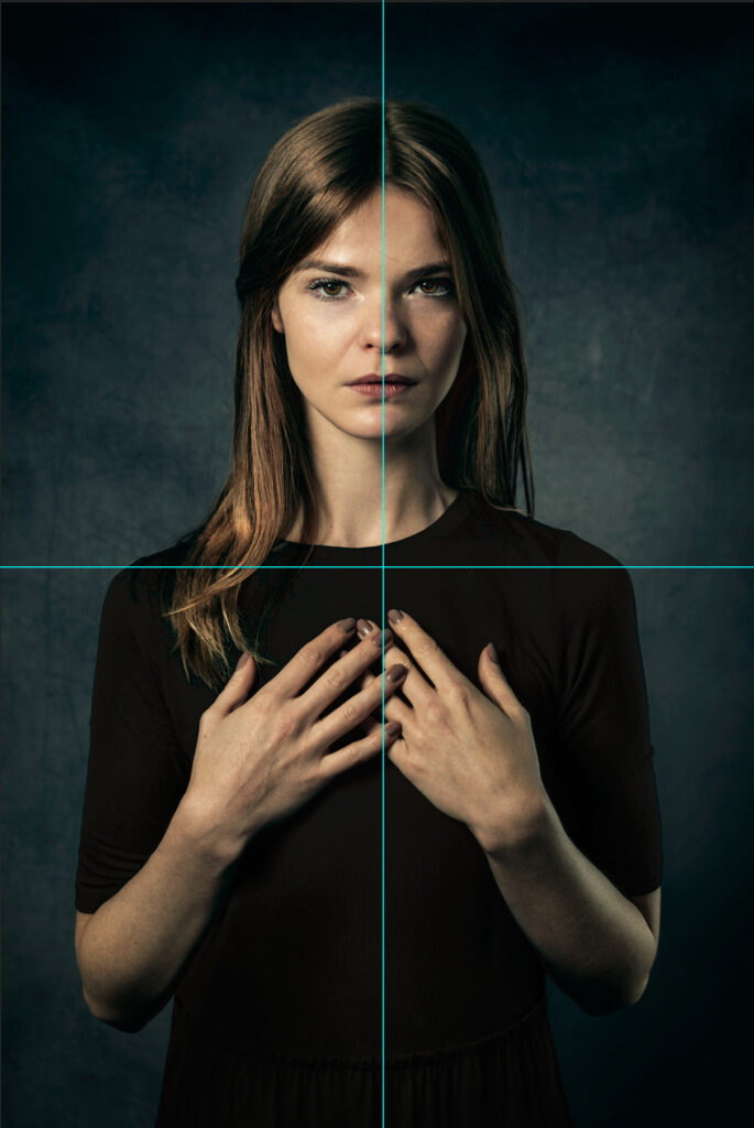
4. Symmetry
Our brains are wired to like symmetry because there is so much of it in nature. It suggests harmony and perfection. It’s wonderful to use in landscapes and architecture in particular. If you look back to the image of The Vyne, you’ll see that the left side almost most exactly mirrors the right.
Symmetry is really effective, but it suits some subjects more than others. For instance, symmetry accentuates the design and structure of buildings. When you have a reflection, it accentuates the subject being reflected because you see it twice.
Sometimes, though, symmetry gets boring. Adding an element of asymmetry will allow you to have the satisfaction of symmetry and the interest created by breaking away from it.

I love the symmetry of the trees reflected in the water, but I also like the break in the trees that shows the misty fields beyond which are not reflected. The sky maintains continuity because it’s still mirrored in the canal. I’ve deliberated used symmetry and then added an element of asymmetry to break it up and add interest.
5. Threes and Odds
Let’s talk about threes! We much prefer an odd number of subjects to an even number, particularly when the odd number is 3. The number 3 is instantly recognisable, whereas once we hit 4 or more, we think about groups rather than individuals.
We really like triangles because they have three sides. The rule of thirds is about dividing the image into 3. We just like threes!
Where we have a central subject, we like them to be surrounded by an even number of people on either side. If you only have two subjects, use the rule of thirds to help break up the image. Where you have more than 3 people, break them up into smaller groups.
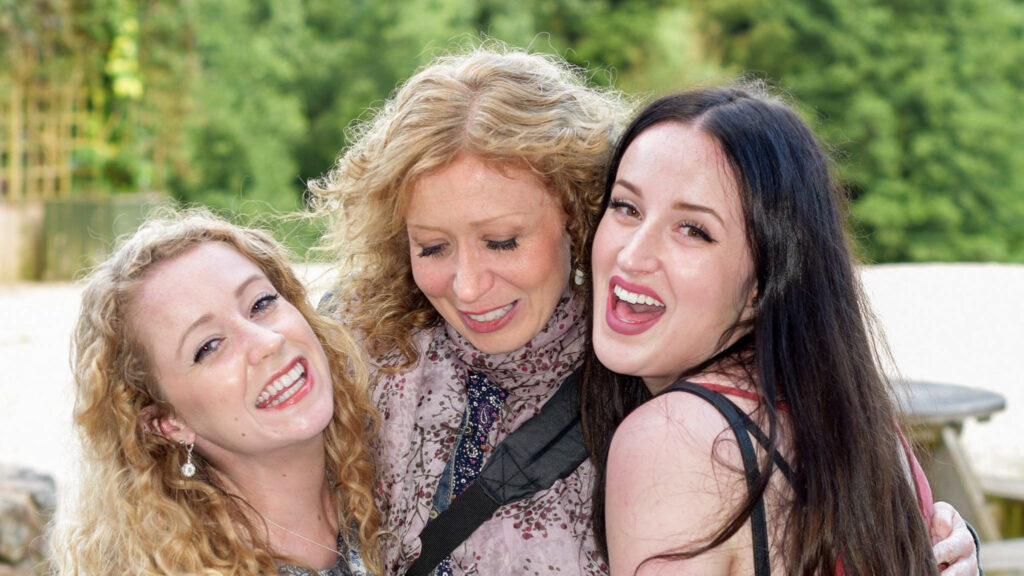
This image of me and my two younger sisters feels aesthetically pleasing because we are a group of 3. Had my mother also been in the image, it would feel more complete to me, but it would have been less aesthetically pleasing.
6. Triangles
Following on from 3s, let’s discuss triangles. They’re visually pleasing because they have 3 sides and we’ve established that we like things in 3s. We like easily recognisable shapes and the shape itself only has to be implied. If it’s incomplete, our brains complete it for us. Look up Kanizsa’s triangle. Without having any actual triangles, we see triangles!
Triangles Between People
Similarly, we create triangles with people. Going back to the image of me with my sisters, you can see a kind of triangle formed by our heads and it feels satisfying that it’s there. We like a dot-to-dot that results in a triangle.

Triangles on the Body
The face itself has a number of triangles. If you can create triangles with the body as well, it makes an image of person much more interesting than if their body was straight up and down.
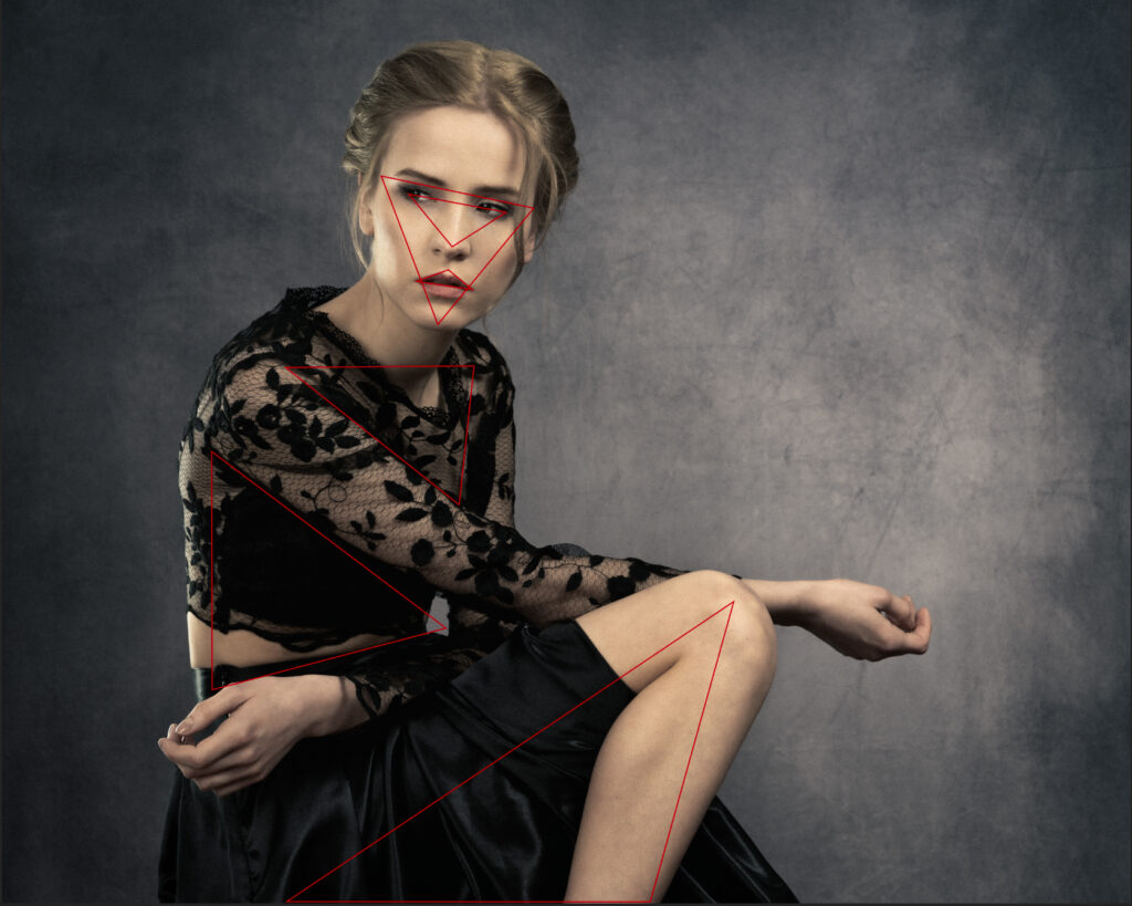
The Sensation of Triangles
Triangles also have the ability to create sensations for us. When the peak is at the top, it feels strong and stable. If the peak is tipped to the side or at the bottom, it feels unstable. An equilateral triangle (where all the sides are the same length) is more satisfying than a scalene triangle (where all the sides are different lengths).
This building is shot at an angle rather than going straight up which tips the peak of the triangle (which you have to auto complete) to one side and in doing so, destabilises it. The image has some nice elements to it, but the thing that ultimately makes it interesting, is that it’s all triangles.
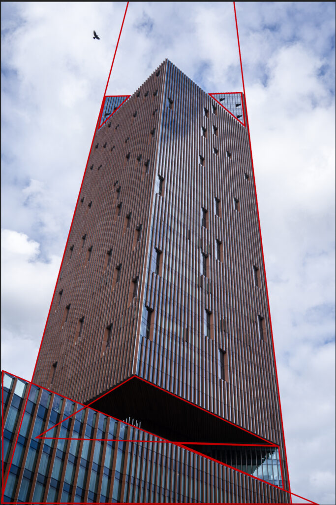
Triangles will always add interest into the frame but be aware of which way up they are.
7. Light and Colour
Light and colour are my favourite compositional elements and the ones that have the biggest impact. I’ve put light and colour together because they play into each other. The light alters the colour you see, but our brain adapts so fast that we don’t notice the change unless it’s a dramatic sunset or until there’s not enough light to see at all. When we photograph people in the “golden hour” – which happens at the hour after sunrise and the hour before sunset – they reflect golden light which is what makes those images so appealing.

This image above follows the rule of thirds, there’s a leading line, the horizon gives us a horizontal, but it’s the light that really makes the image special. It gives what would otherwise be a bland image incredible colour. The colours are enhanced a little, but they were all there in the original photograph.
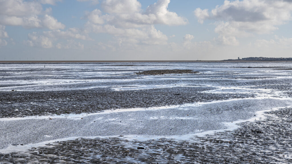
This photograph was taken at the same place at around midday and you can see the difference. Everything is clearly defined because the light is hard at this time of day and the light is blue in colour. I like that the hard light brings out texture in the sand and water (which is what makes the water sparkle), but I know the colour of the light is pretty ordinary.
Never underestimate the importance of colour!
8. Viewpoint
Power, Inferiority and Intimacy
Where your camera is, in relation to your subject, is incredibly important. If you are above your subject, they will feel powerless and inferior. At eye level, your subject will be looking straight back at you and seem like an equal. If you are below eye level, you give your subject power and dominance. There was a fashion for photographing people from above because it slims the body and helps define the jaw line, but having the subject look up is disempowering. Corporate headshots are often shot from below eye level to give a sense authority.
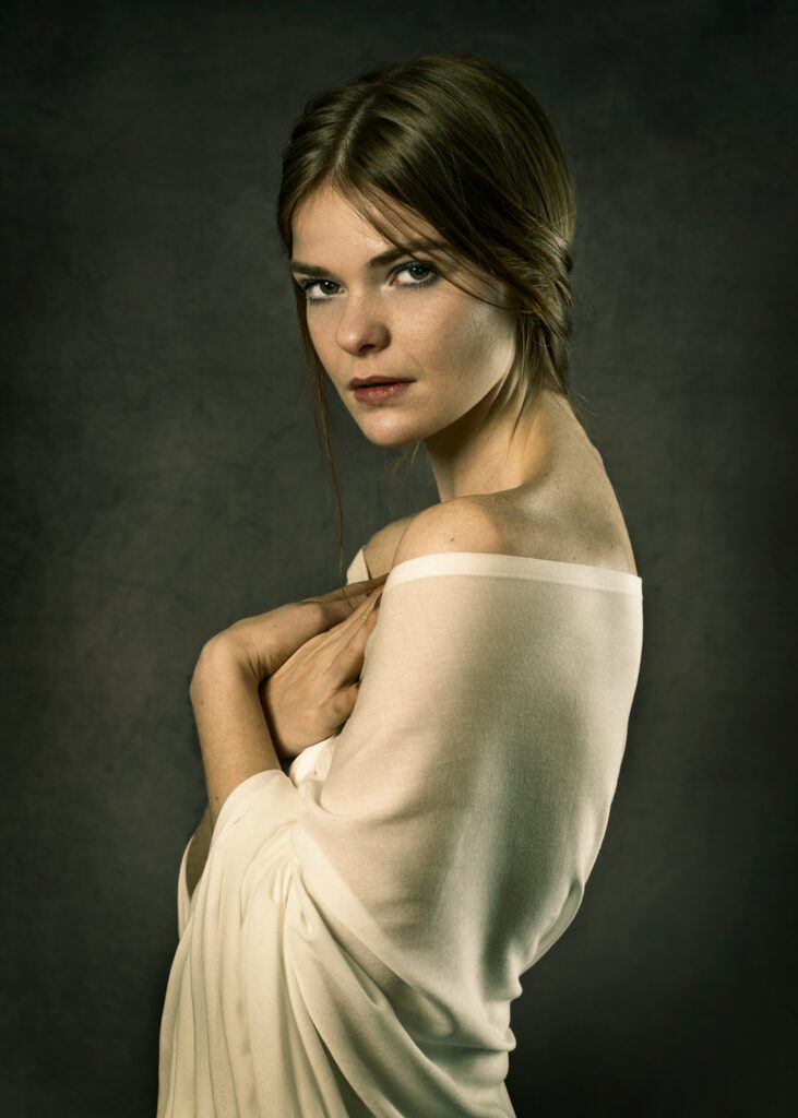
In the image below, the camera is slightly below the eye level of my subject. The bare shoulders, pose and expression make her appear vulnerable, but I didn’t want to strip her of all power. By taking the photo from just below her eye level, there’s a hint of inner strength in spite of her apparent vulnerability.
Vantage Points
Taking a photograph of a landscape from a vantage point works a little differently because we are more inclined to feel the wonder of the view rather than the vulnerability of the landscape. Having said that, Ansel Adams, took his photographs from a height and he was highlighting the need to preserve the wilderness lands of America. He was showing how incredible they are, but also, how vulnerable they are to human interference.
9. Depth
Depth really helps to bring your images to life. Photography is 2D so the only depth you’ll see is what you put in there. There are several ways to create depth one of which is to use leading lines (diagonals) which we discussed above.
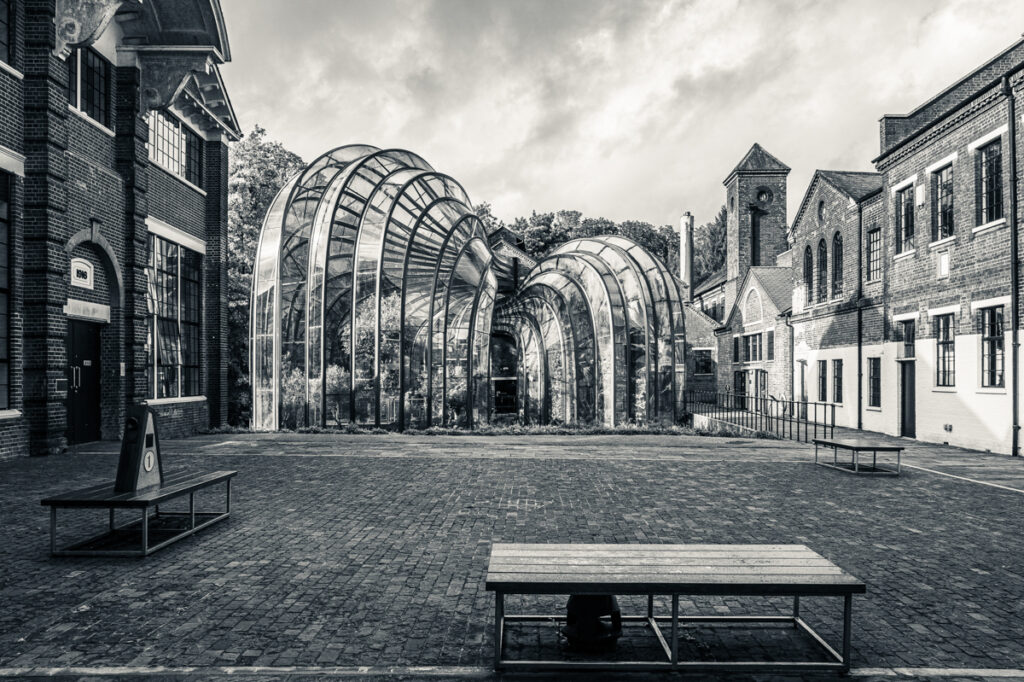
Another way is to try and create a foreground, midground and background. The benches in this image create a foreground, then the changing direction of the paving stones and the glass houses are the mid-ground while the trees and further buildings create a background. The diminishing size of things helps give us perspective. We know things far off appear smaller, but we need a point of comparison to see just how far off they are. Putting things in the fore, mid and background helps us with scale.
Combine
If you can combine a number of these compositional elements in one image, you will have an excellent photograph. Remember that some compositional guidelines work better for particular subjects than others. For instance, symmetry can feel quite boring in a group of people, but for architecture and reflections, it can be stunning.
Contact Me
If you have any questions or would like me to create marketing images for your business, please feel free to email or message me on Facebook and Instagram.